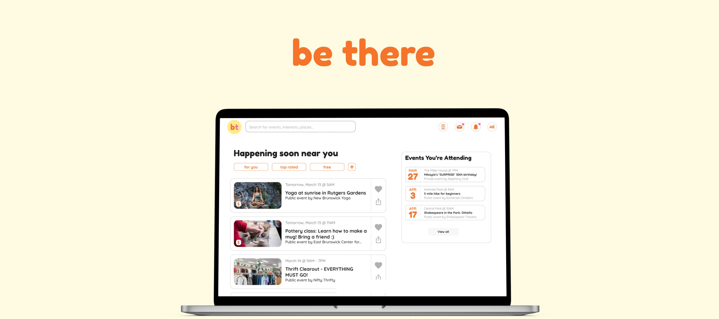
Bringing people together without the hassle.
Be There is a one stop shop for event planning and discovery. Plus, guests get an incentive reward every time they attend an event, without anything extra on your end.
Duration
1 month
Platform
Web
Role
UX Designer
Getting people to attend an event is easier said than done.
Everyone is tasked with planning an event at least once in their lives. Whether it's putting together a surprise birthday party for a friend, celebrating a wedding, or planning a small get together for the holidays, it's something we all eventually end up doing. And it always comes with the same headaches - getting food, making sure there's entertainment of some kind, buying and setting up decorations... the list of tasks seems to be ever growing.One task in particular however, is the most stressful (and also most important) - the part where you actually have to get people together. The guest list is really just the half of it. The real fun comes with making sure people show up, because without people, it's not really an event. And that's the thing. What motivates people to actually attend events? How can you be sure that people will come to something you're hosting without chasing them down for an answer?That's where Be There comes in. Be There is a solution that aims to not only make event planning more seamless, but to get people to actually go to events. If guests attend an event through Be There, they get a reward that's catered to their interests. This provides that little bit of extra push that guests may need to actually follow through.Here’s how it was developed.Discovery: The Plan
For this task, I was provided a project brief that included basic research insights, a description of the brand, and the problem being tackled. Because I already had some secondary research findings at hand, I decided to make a plan that would provide me further opportunities for discovery.Objective
Research shows that only 20% of people that say they will attend an event actually end up going.Further understand what causes this outcome, what is preventing people from not attending events.Essential Questions
What motivates people to attend events?
Why don't people follow through with their initial responses?
How do people keep track of their events?
Are people as interested in getting together as we think?
Methods
Industry Leader AnalysisGuided DiscussionsAffinity MappingIndustry Leader Analysis
I decided to begin my research with an analysis of industry leaders so that I would have a proper understanding of what people are already familiar with when it came time to conduct guided discussions. Seeing what's out there would also give me a better understanding of how to deal with my own solution.I looked at Facebook Events, Meet Up, and Eventbrite and chose user journeys that were relevant to the problem at hand, such as creating events and attending events, and took notes on what I found successful, frustrating, and actionable. I also created a table to compare my findings and measure which websites had the features I found to be most essential for the user's experience.My findings after completing an analysis of each website were as follows:Pressing “attend” should always be readily present.
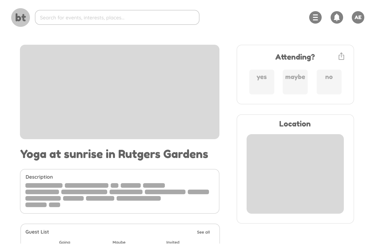
Meet Up and Eventbrite implemented this practice best. Both websites gave users the opportunity to provide their response regardless of how far the user scrolled down the page.
Communication between guests and host is essential.
Facebook has a discussion thread on almost every detailed event page, encouraging users to discuss with each other and ask questions if needed. I felt that this feature would be necessary for the user’s comfort.
Users should have access to all the information they need.
Compared to the other two websites, Eventbrite felt very impersonal because of the lack of event detail provided to the user. While basic information was shown, there was no way for users to see a guest list or photos of what to expect.
Guided Discussions & Affinity Mapping
Now that I knew what was already being provided to users in this industry, I needed to talk to people to try and understand the psychology of the issue. Using my research questions and insights from the industry leader study as a foundation, I drafted a script to use for guided discussions. I focused most of my questions on how participants felt about both going to events and hosting events - what their pain points were, their pleasures, and their experiences using event applications. After completing the discussions, I organized my findings into an affinity map for synthesis.Here were my key findings:The main motivation for attending events is seeing people they know, even if it’s an event they aren’t particularly interested in.
Anxieties occur when the attendee doesn’t know what to expect out of the event, and if they feel they won’t know anyone there.
Hosts use many different applications simultaneously to inform guests of events, which causes frustration.
Main pain points when hosting is lack of guest communication and how time consuming it is.
How Might We…?
Before beginning to build the architectural structure of the product, I decided that I needed to re-center myself with some How Might We statements based on my research synthesis. After researching, I always like to revisit the problem to make sure I'm still mentally on the same page, and not letting all of my other findings cloud my upcoming design decisions.How might we...Further motivate users to attend events?
Help users more easily discover events that they’re truly interested in?
Ease any anxieties that come with attending events?
User Flows
After re-establishing the main goals of the product through user research, I decided on my red routes. The most important interactions for users will be to discover events, access the events they're attending and invited to, and create events. I created flows for these routes and put them together to draft the navigational foundations of the site.Now that I had a basis for most of the screens I'd need to create, I felt prepared to move on to sketching.Ideation: Red Route Sketches
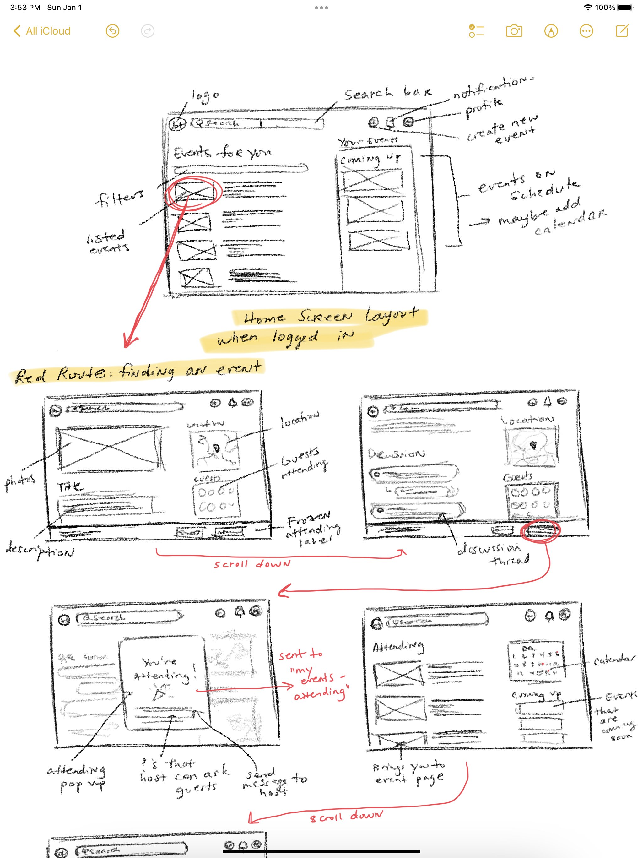
Before beginning, I went back and checked out my findings from the industry leaders analysis. Specifically, I was looking for actionable aspects and standards that I could use towards my own solution. For example, I definitely wanted Be There's brand to have the friendly disposition that Meet Up had, while maintaining the intuitive and simplistic interface of Facebook Events. With these qualities in mind, I began sketching.I also referenced my findings from my affinity map to ideate essential features that would align with the user's needs: Event clarity will help the user feel more comfortable with attending.
The discussions I had with potential users told me that people start developing anxiety towards an event when they don’t know what to expect from it, leading them to back out. Event details needed to be a focal point so that users had a good idea of what the event would entail.
Communication is vital to both attendees and hosts.
I made sure to incorporate multiple methods of communication on the event page, such as discussion threads and a messaging system. Because this was a pain point for most discussion participants, it became an essential feature.
People are more likely to go to an event that they will get something out of.
Whether this comes in the form of socialization, free food, or entertainment, my findings told me that people need an incentive to attend an event. I focused on making the guest list a main feature of the event detail page, and also added a monetary incentive (discount code, free shipping, etc.) based on the user’s interests to provide that additional push.
Style Guide
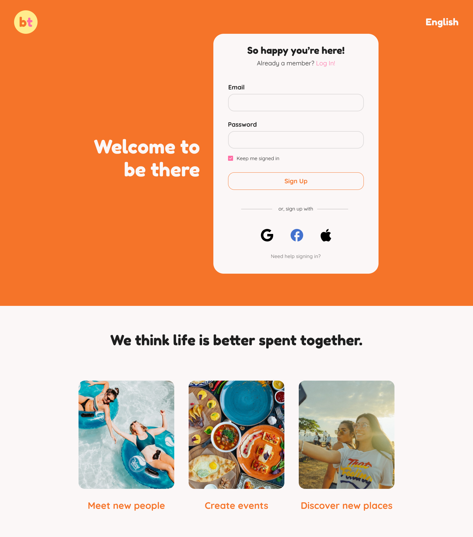
Before translating my sketches into wireframes, I needed to carve out a brand for the product. I was provided specific attributes for the brand's personality: a trusted friend that cares about helping people and making a difference in the world. Be There is caring, familiar, humorous, and optimistic. I used these characteristics to inform my design decisions.I started by gathering a collection of photos that exhibited people laughing and eating together to paint the correct picture of friendship and comfort. From there, I chose a color scheme that was warm and exuded optimism. Orange, yellow, and pink are analogous colors that represent both excitement and passion - so I thought they'd be perfect for a brand that championed those attributes.As for the typography, I chose Fredoka One for bigger headings and Quicksand for smaller headings, bodies, and captions. Both of these fonts are round, casual, and readable - giving the brand a more playful aesthetic that would ideally help the user to feel at ease.Wireframes
Now that Be There's brand was carved out, I was finally able to bring my sketches to life by wireframing. I then tested my designs with 4 participants to scan for usability and navigational issues before continuing to develop.

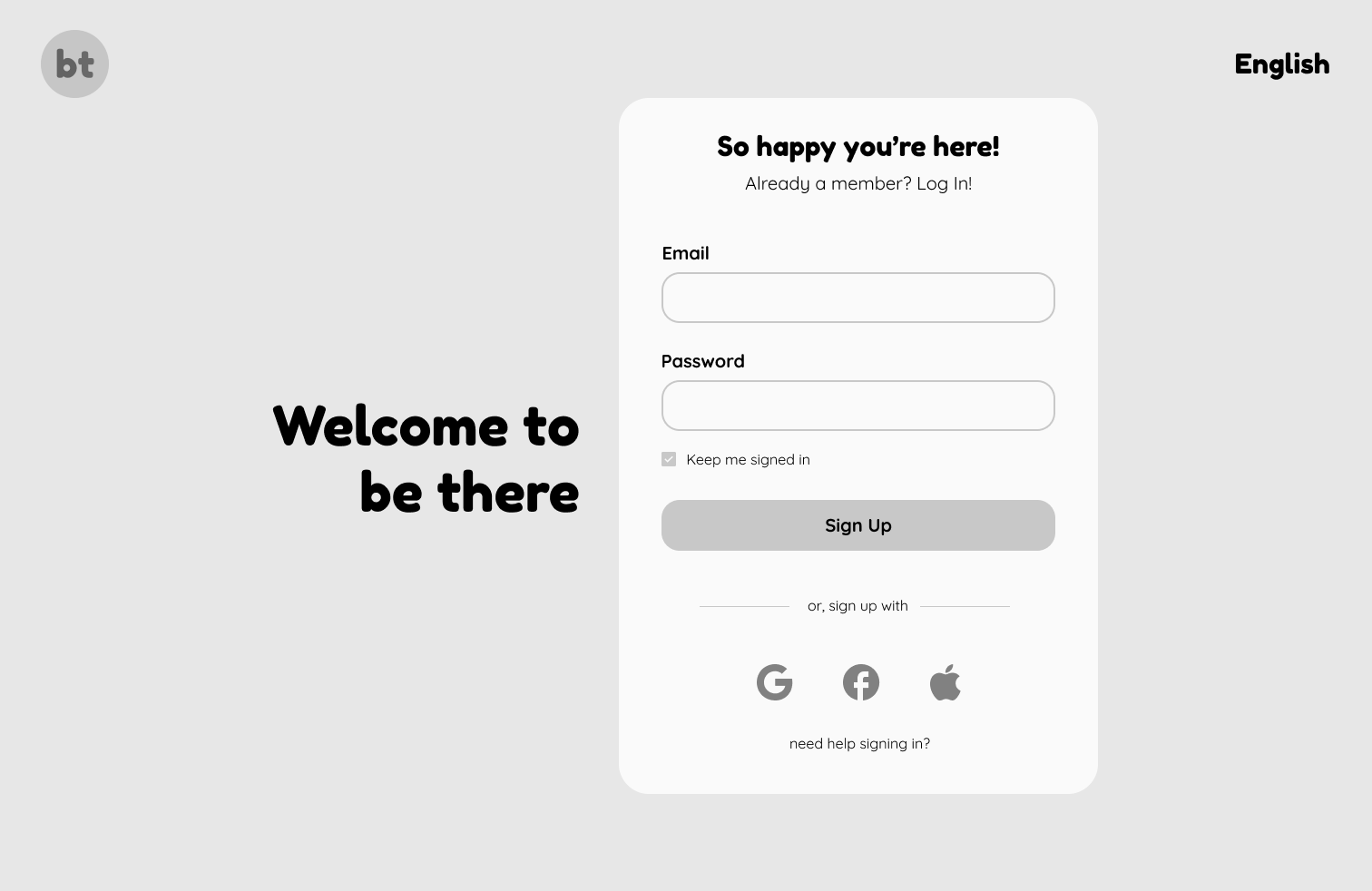
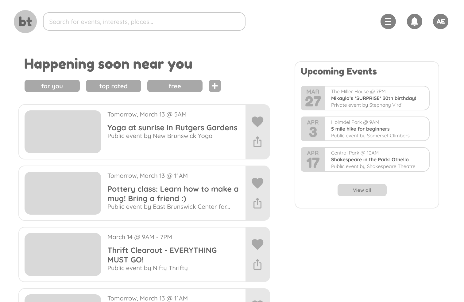
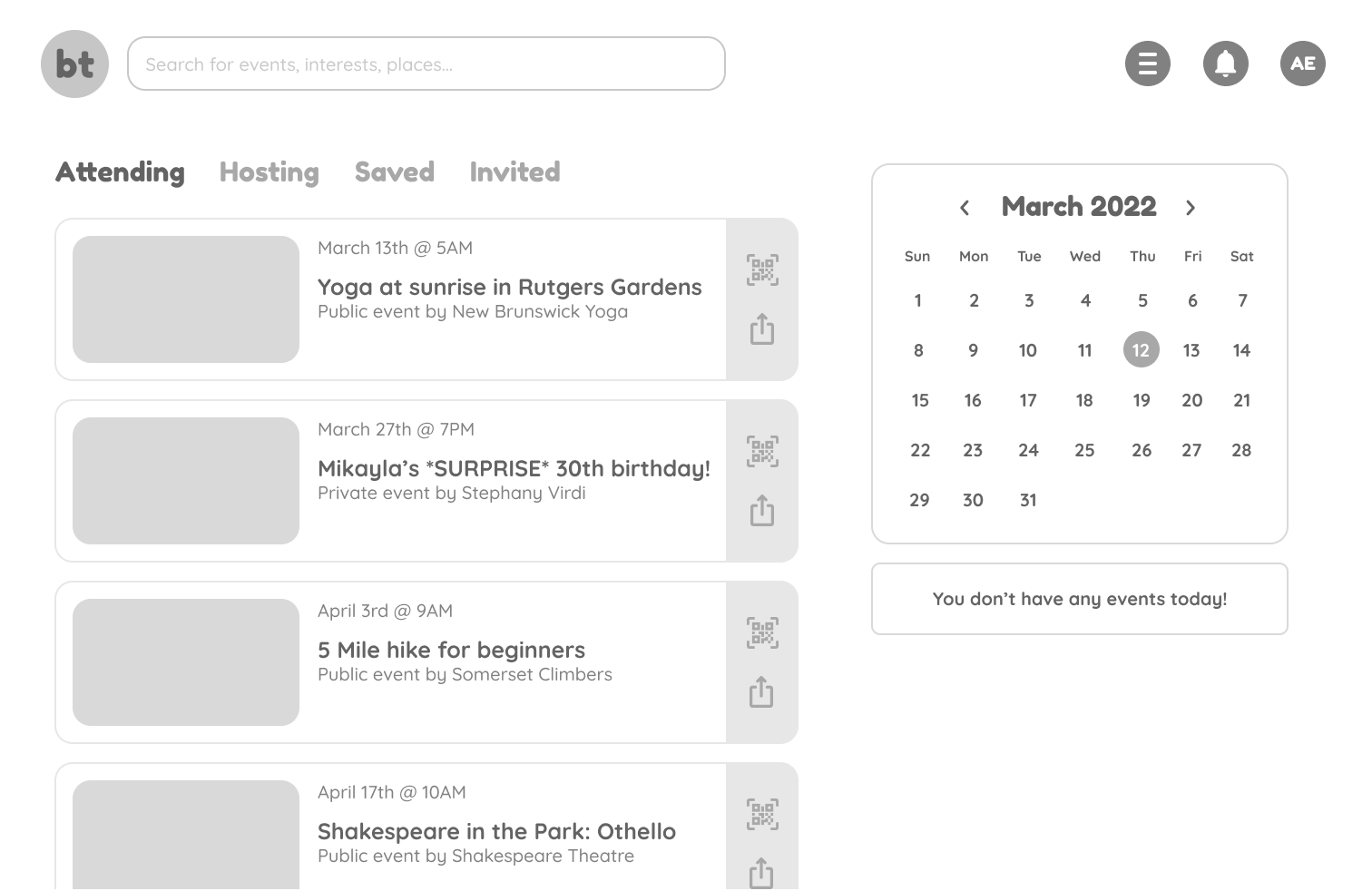
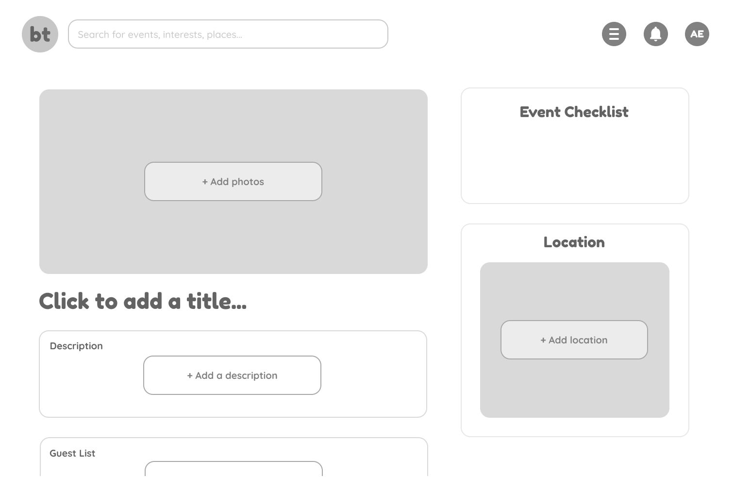
Below are my wireframed screens and my testing results.Here are the results of my initial test:4/4 participants did not experience any navigational issues.
2/4 participants wanted to be able to view their past events, but that feature was not available for them.
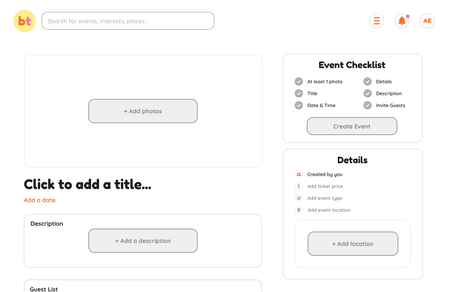
2/4 participants were confused by the function of the event checklist on the “create an event” page.
1/4 participants weren’t sure if the upcoming events on the homepage were events that the user was attending or if they were just general events that were happening soon.
Iterations and Low Fidelity Designs
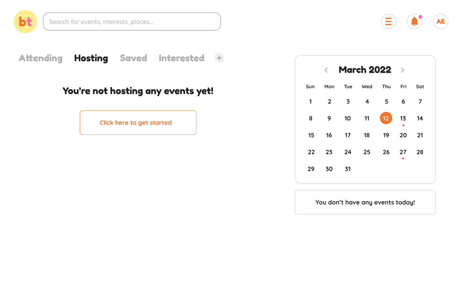
After my first round of testing, I had a lot of changes to make before going any further. I implemented color while making these changes and filled in images to give the testing participants a truer experience.Based on the testing feedback I received, here were my key iterations:Added drop down menu in “Your Events”
Because multiple users wanted to be able to see their past events, I decided the best solution would be to add a drop down next to the headings to prevent overcrowding in the text area.
Added more content to the event checklist.
In my wireframes, there wasn’t enough content in this section for participants to understand its function. I developed this more so that I could receive more accurate feedback in my next round of testing.
Changed text in “upcoming events” on homepage to “events you’re attending”.
Participants expressed confusion by this language, so I changed it for more clarity.
In my second round of testing, I drafted a new script that included prompts for the profile page screen and "your rewards" screen, which I included to my low fidelity prototype in order to create a more realistic user experience. I tested with 4 new participants and these were my key results:4/4 participants did not experience navigational issues.
2/4 participants found the pink accent color difficult to read.
4/4 participants found the “create an event” screen to be intuitive and found the checklist to be helpful.
1/4 participants thought there should be a direct messaging feature to improve communicative accessibility.
2/4 participants were wondering how to tell if an event costed anything to attend.
No issues with the profile page or the rewards page. Participants liked that they could curate what incentives they received based on their interests, and found that the option to click to view their reward was beneficial to privacy.
High Fidelity Designs and Testing
Keeping in mind results from my second round of testing, I iterated on a few aspects in my final design:Made the pink accent a darker hue and bolded the text for improved readability.
Added money icons to events that costed money to indicate to the user that they were not free events.
I thought the suggestion of a direct messaging system was in line with my users’ needs, so I added a messaging feature to the navigation bar that includes chat rooms for events and direct messages between users.
Check out Be There's hi-fi prototype below!Final Thoughts
I had a lot of fun developing this solution - not only because I'm passionate about the problem, but because it changed my perspective on the issue. I've always enjoyed hosting and attending events, but have found myself frustrated countless times with the amount of energy it expends. I've caught myself asking, "Why hasn't anyone perfected this yet??" But through this process, I've learned first hand that it's not that easy to come up with a solution that quite simply depends on people following through with what they say they'll do. There's just so many variables. Nonetheless, it was a challenge that I enjoyed facing!Here's a couple of things I learned along the way:Don’t shy away from completing more secondary research.
Even though I was given some basic findings that validated the problem statement, if I were to do it over again, I would dedicate more time to initial discoveries. There’s so many psychological reasons as to why people do the things they do, like not attending an event they had intentions to go to, or finding reasons to not go at all. While I did have discussion participants scratch the surface of this issue, I feel like if I dove deeper into scholarly articles I could’ve probably found more insights to help me develop an even better solution.
Develop wireframes enough so that testers don’t need to guess.
There were a couple of features on my wireframes that I completely just bypassed adding content to - and this prevented my users from understanding the basic function of those features. I feel I definitely could have gathered more valuable feedback on my first round of testing if I wasn’t assuming that my testing participants would understand the point of these features without content.


