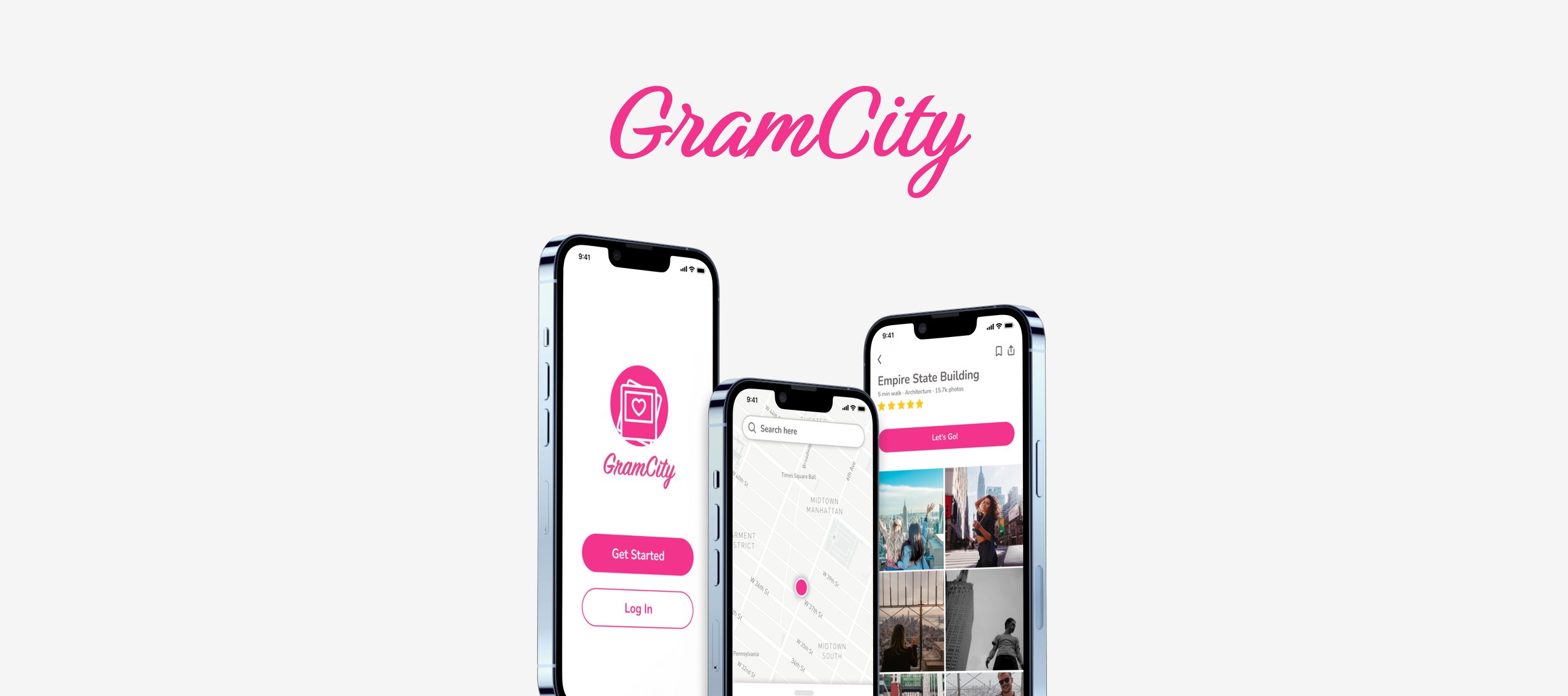
Finding photo-ops has never been easier.
GramCity is an application that makes it easier to find photo locations - allowing you to focus on just documenting the fun.
Role
UX Designer
Duration
1 Week
Platform
Mobile
Finding new and unique places to take photos is not only time consuming, but annoying.
It's finally summer, and you've been dreaming of the amazing vacation you've had planned for months now. You're going to 3 different islands in Greece. THREE! The hard part is over - everything is paid for, experiences are booked, and you've got some free days in between to just stick to exploring. You head to Instagram to see what everyone else does while they're there (and to excite yourself even more, of course). You browse through hundreds of photos of boat trips to sapphire colored lagoons, pictures of couples against backdrops of white buildings stacked on toppling cliffsides, and picturesque alleyways that lead to impossibly blue waters. You know for a fact that you're going to search far and wide for these places, so you too can capture yourself in these unforgettable moments. But where do you even begin? Just thinking about all the research you'll have to do to find these dreamy avenues is giving you anxiety - let alone figuring out how to get there from your resort. Incoming, GramCity! With this application, you no longer need to stress over finding all the nitty gritty details of where to go to make those memories. Simply plug in your destination, filter what kind of sights you're looking for, and create your photo-op itinerary.Keep reading to see how this was developed!Method: Google Design Sprint
GramCity is a pre-existing application originally used for the purpose of editing photos so that they are Instagram ready. I was assigned the task of designing a feature that provided users with photo-ops tailored to their specific destination and interests, along with the capability to plan out these sights in an itinerary.I used Google's 5 day design sprint method to carry out this solution. GramCity provided me with initial research artifacts such as design constraints, highlights from user interviews, and personas. Therefore, I was in charge of synthesizing this research, ideating potential solutions, developing storyboards and wireframes, and user testing.Day 1: Map
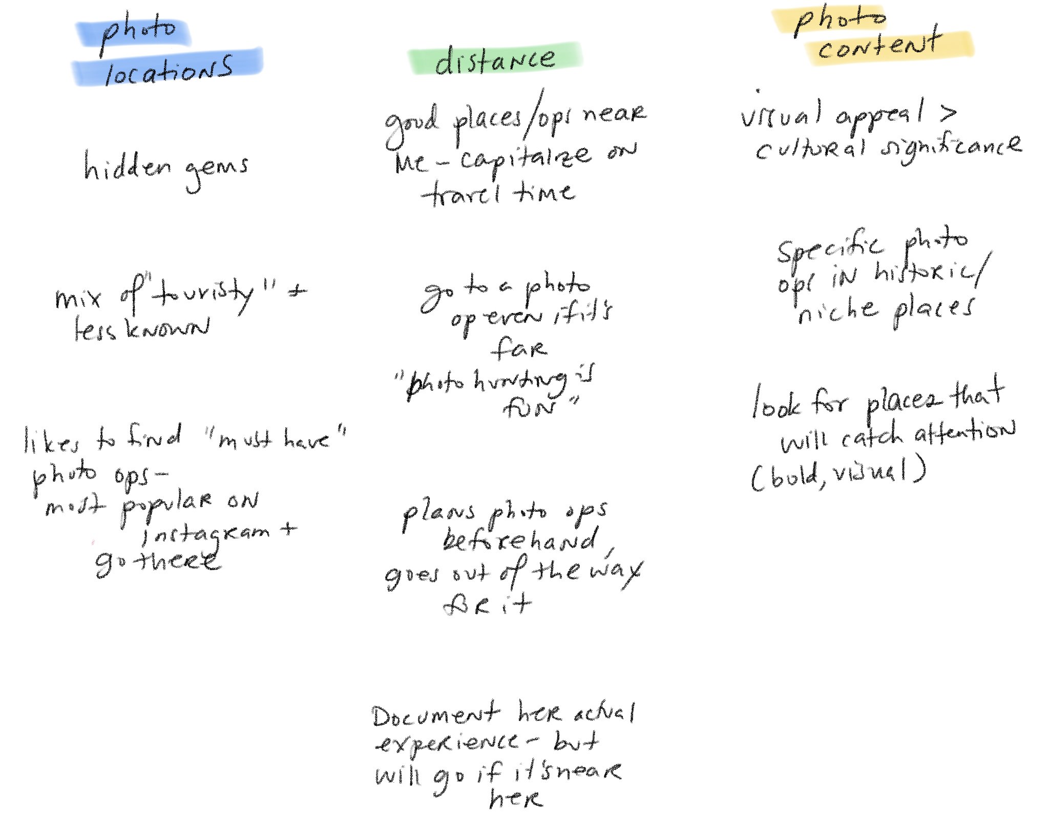
Since GramCity had already provided me with research insights, it was my job to synthesize it and figure out what kind of solutions I can come up with. I decided to take all of the quotes GramCity provided me from user interviews and categorize them into themes to better focus my ideas.I found that there were three underlying themes throughout all the quotes I was provided:Photo location
While most participants were looking to find the “best” well known locations to take their pictures at, an equal amount were also interested in finding lesser known locations that might allow them to stand out more.
Distance
Participants were concerned with the amount of effort they’d have to put into traveling to their desired locations. While some didn’t want to waste much time on their photo taking, many disclosed that they didn’t mind putting in the work to travel further.
Photo Content
Participants had a wide range of interests when it came to what kind of locations they’d like to see. Some cared about historical and cultural significance, others only cared about aesthetic. This told me that when it came time for any filtering, I needed to ensure I was marking all the boxes.
Personas
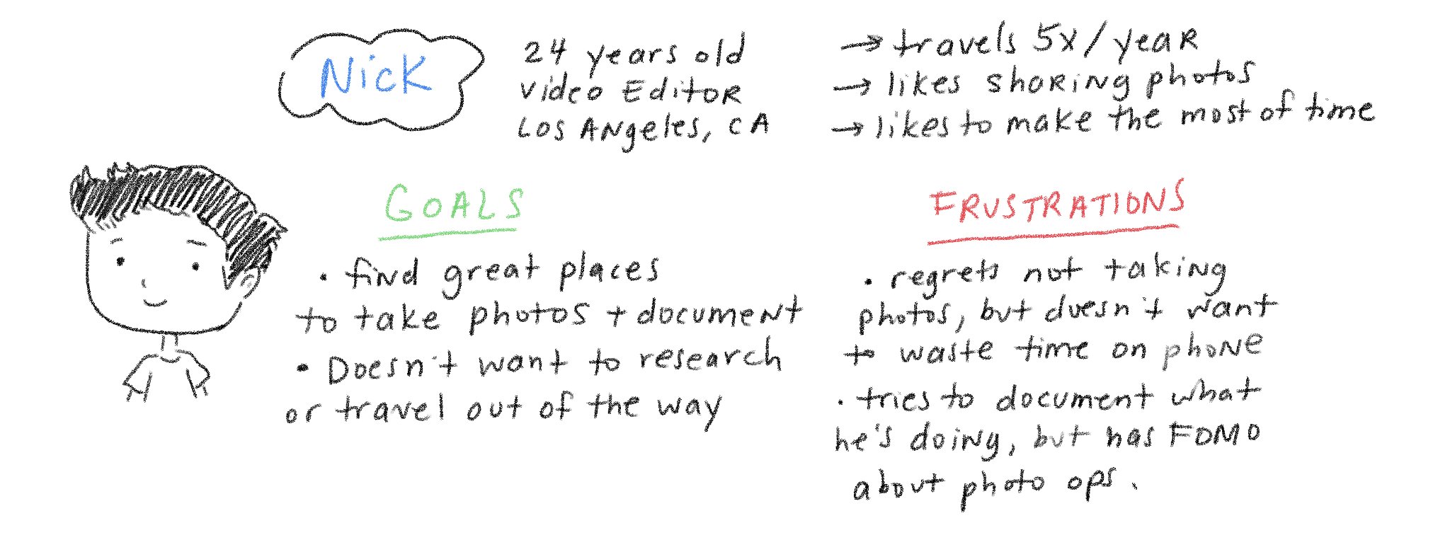
Nick and Sarah are the personas I was provided by GramCity to reference. While Nick is interested in taking better photos while traveling, he'd rather focus on the experience than take the time out to research. On the other hand, Sarah finds joy in planning out her travels based on photo opportunities, though she resents how long it takes to do.Synthesis: HMW’s and User Experience Maps
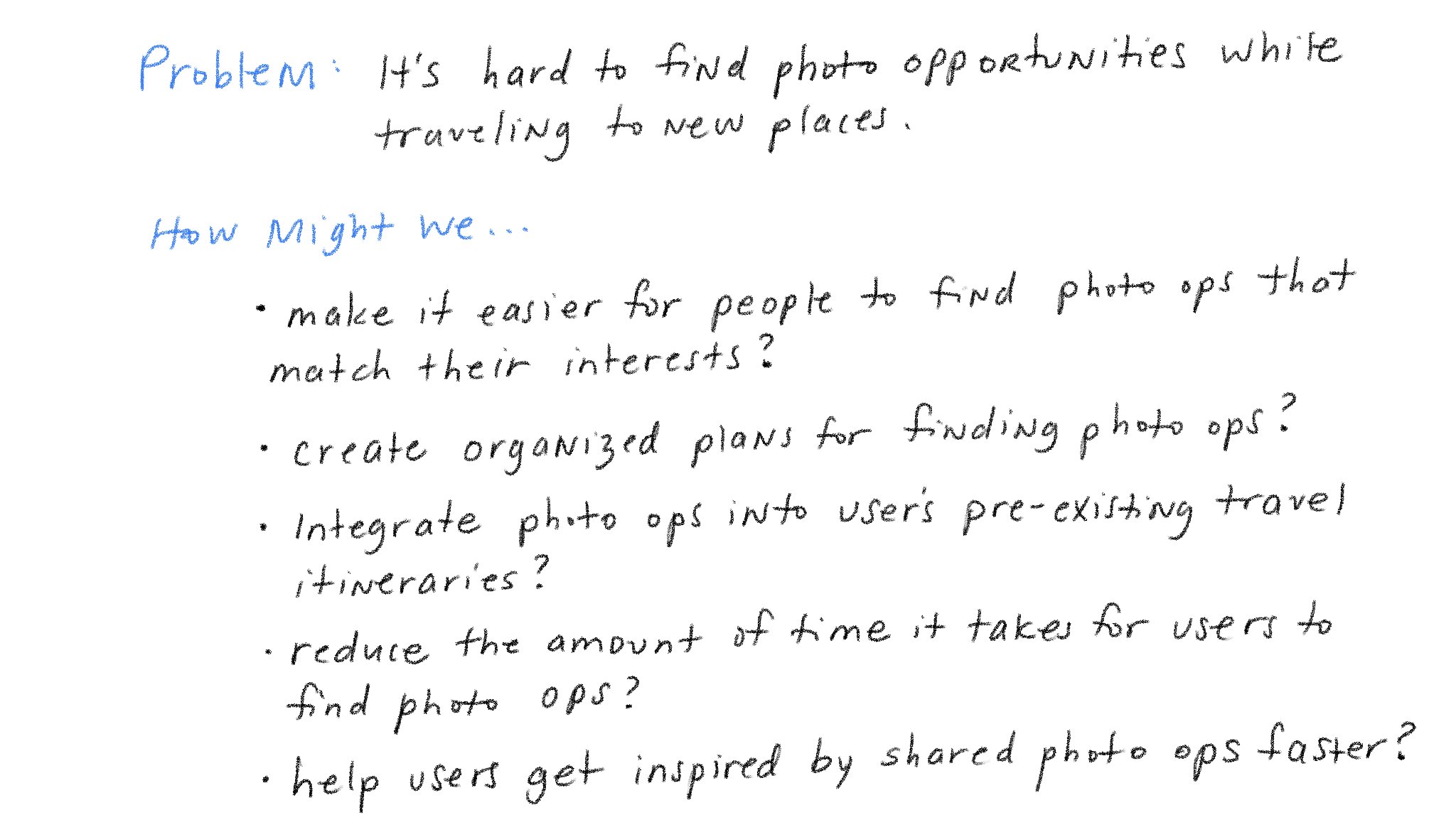
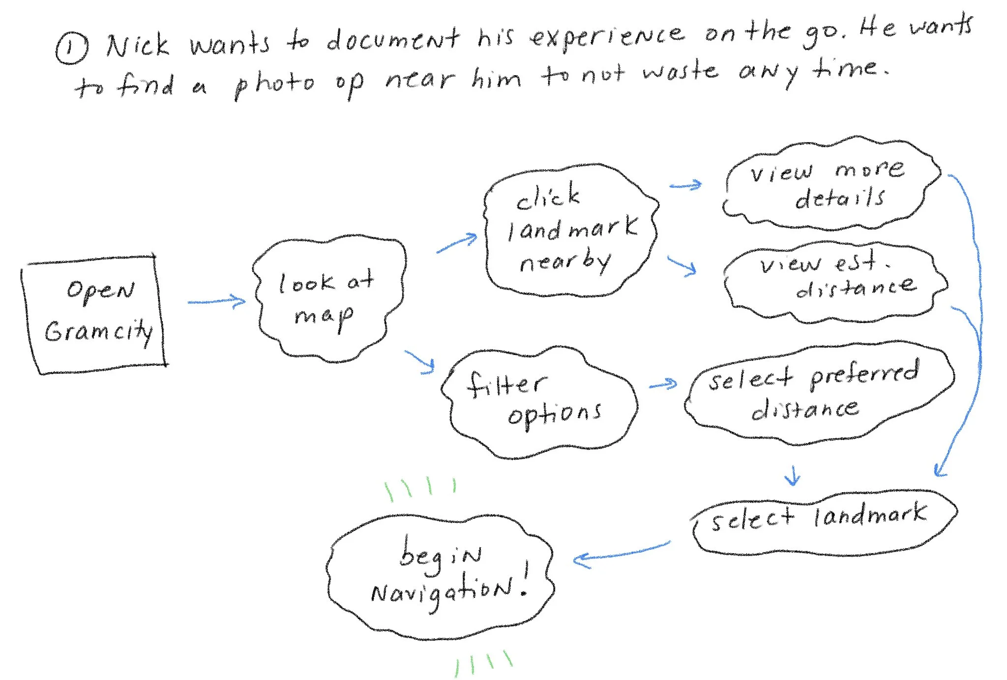
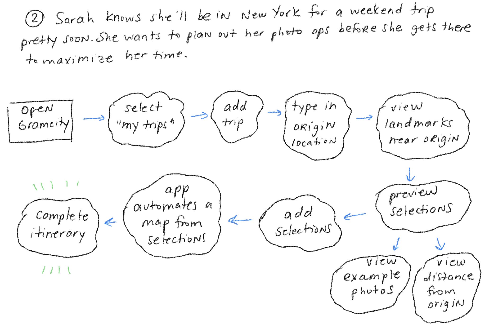
Studying Nick and Sarah's pain points and goals allowed me to better envision possible solutions to help with their individual problems. Based on the data provided from both interviews and personas, I came up with How Might We statements to further empathize with potential users.I then created user experience maps for each one of my personas to isolate which features would be most essential for my user, depending on their problem. I came up with specific scenarios so that I can empathize with the given personas and envision what their decisions would be as users.Nick is looking for a quick interaction.
He needs to see landmarks that he’s near on the map right away with in-app location details and directions provided to not waste any unnecessary time.
His user journey should be quick, easy, and painless.
On the other hand, Sarah’s journey is a bit more complex.
Sarah doesn’t mind going out of the way to find photo opportunities while she’s traveling, even if it takes time to get to.
She needs to be able to plan out her experience so that she can make the most of her photo hunting, and feel satisfied with the result.
Her journey should be curated, mindful, yet still simple.
Day 2: Sketch
Now that I had a clearer picture of what potential users needed out of the GramCity feature, I started looking at screens from competitors that were already successful for more insight.Lightning Demos: Competitor Analysis
Pokemon Go
The first app I looked at was Pokemon Go. I knew users needed a map to discern where go to photo locations would be, and this app was the first one that came to mind because I was drawn to the simplicity of it. The UI allows the user to easily see where landmarks are in comparison to your own location. The “nearby” pop up screen enables users to see which Pokemon are close to them - this is a feature that can be seamlessly replaced with relevant and popular photo ops. The greatest part of this feature is that when you click on the Pokemon you’d like to get to, the navigation brings you straight to it. Google Maps
When you think of navigation, Google Maps or Apple Maps are the go to. Users will be the most familiar with these apps, so it’s essential to observe what makes them so successful in the navigation department. Thanks to it’s architecture and UI, Google Maps does a great job at making a massive amount of information digestible for the user. For the context of the feature I'm designing, I was looking mostly at the "Latest In..." pop up screen, which tells users everything they need to know about locations in their area at a quick glance. GramCity is primarily a photo editing app that takes a lot of inspiration from Instagram, so I thought it’d be a good idea to check out its interface and key screens. Instagram’s “For You” page makes it incredibly easy for users to discover content that’s curated to their interests. Pictures and reels take up the majority of the screen, and automated categorical suggestions allow for easy filtering. In the personas I was provided, it was disclosed that finding inspiring pictures for travel locations was time consuming. Adding scrolling feeds for specific locations would aid with that. AirBnB
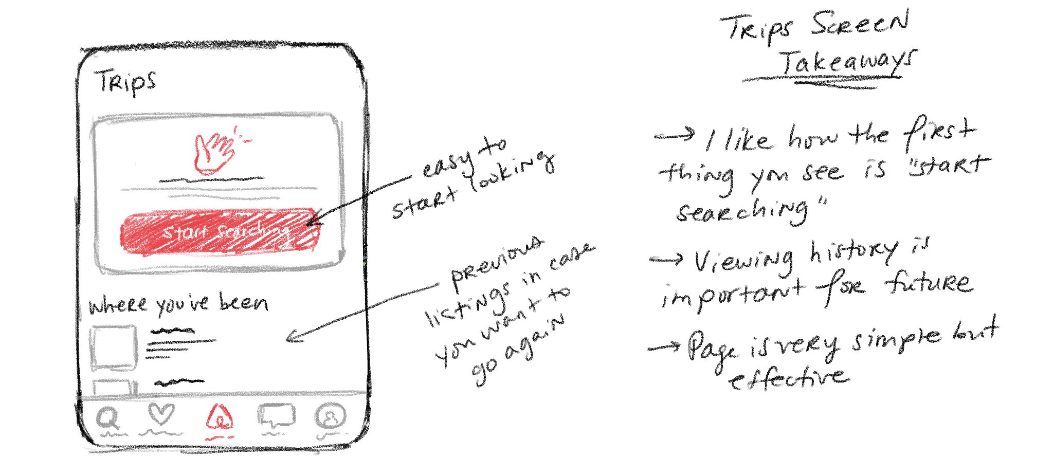
Lastly, I checked out AirBnB’s screens. I thought it’d be helpful to see how AirBnB organizes users’ travel itineraries so that I could have a better understanding of how to deal with GramCity’s feature.The first thing the user sees when they click on the corresponding icon is the “start searching” button along with the trips they’ve already planned through the app. This points the user in the right direction and makes it straightforward to begin a search. Sketching Screens: Crazy 8’s Exercise
After drawing all those competitor screens, I was more than ready to buckle down and start bringing my own ideas to life. I used the "crazy 8's" method to exhaust everything I was thinking onto paper.Drawing from the insights of both the initial research I was provided and my competitor analysis, there were three things I was thinking of while drawing up potential screens:The first thing the user should see is the photo locations that are near them to ensure it is a fast interaction.
The interface should be simplistic and not distract the user from the main objective.
Since this feature is about taking great photos, users should be able to quickly see what their desired location looks like.
Based on these considerations, I was caught between two different screens I had drawn up. I wasn't sure if the home screen should act as a newsfeed or a map. Ultimately, I decided that visually seeing which sights are closest in relation to the user on the map would be more closely aligned with the needs expressed in the given personas and user interviews.Solution Sketch
My solution sketch features the interaction that enables the user to set navigation to a landmark that is nearby. Users will open the app, check the map, click on the desired landmark, land on a detail screen, and set their navigation.Day 3: Decide
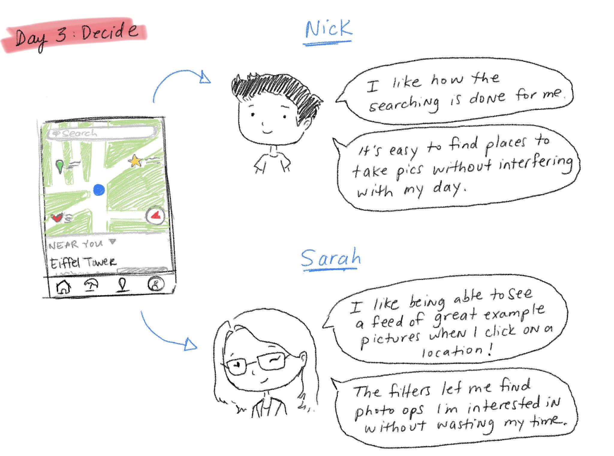
Before drawing out any other screens, I had to return back to the mindset of my personas and empathize to ensure that I was designing a solution that would actually be successful for their needs.Nick expressed that he didn’t want to waste any time looking for locations while he was traveling.
Sarah was frustrated with finding photos that were already taken to inspire her. “Wasting time” was also one of her pain points.
The screen I designed has quick solutions to both of those issues while maintaining simplicity and clarity, so I knew I was headed in the right direction!
Storyboarding
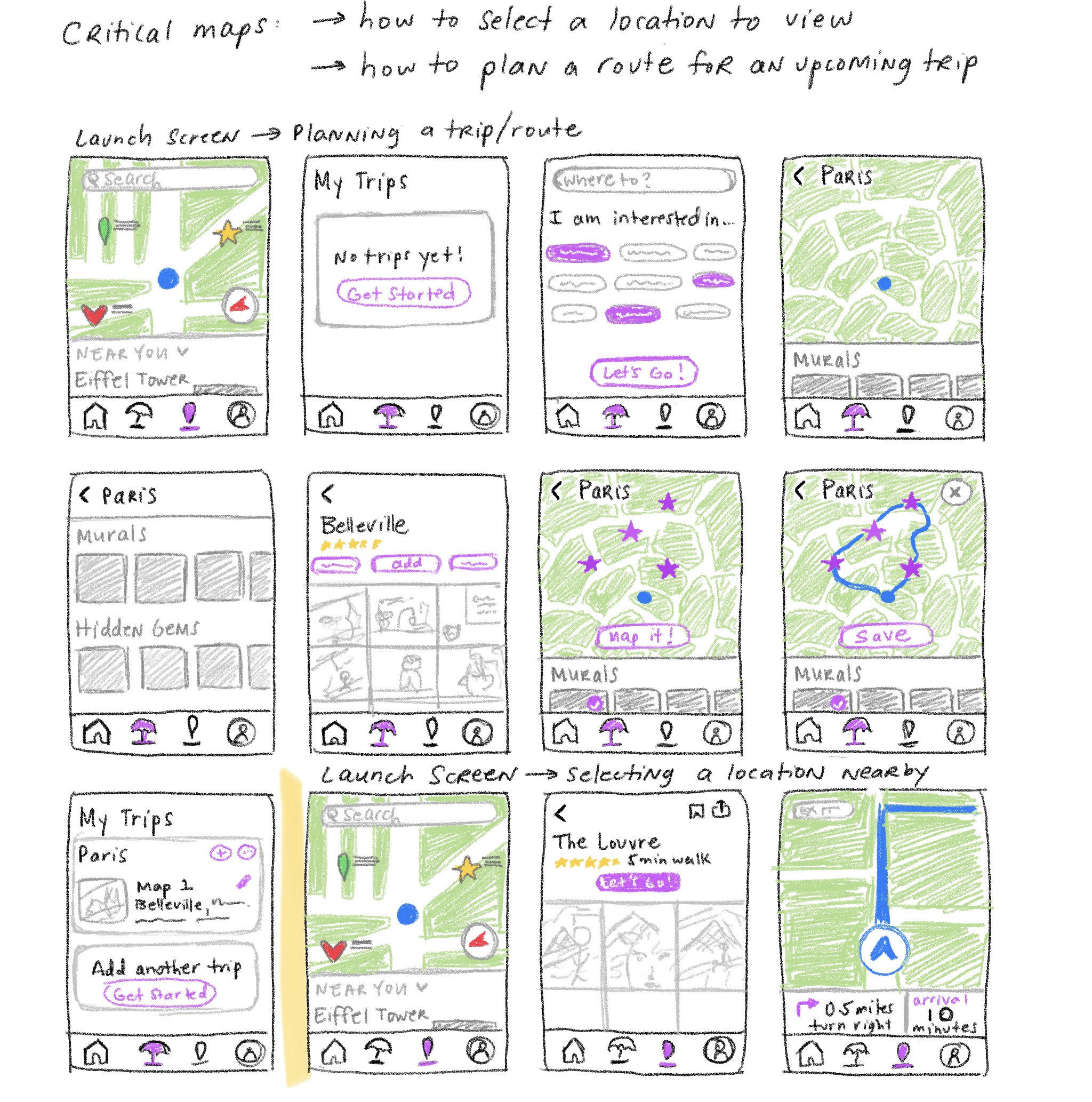
Now that the rationale behind my sketches was fully considered, it was time to create a storyboard of my critical screens:The two interactions I focused on were selecting a location to view and getting directions to that location, along with planning a photo op route for an upcoming trip. I wanted the application to feature both needs equally - finding locations near you while on the go, and the more methodical approach of planning a travel itinerary around the photos while also seeing great sights. Before planning a trip, users could filter their results so that the process of finding what actually interests them becomes easier and faster. Day 4: Prototype
After sketching out the storyboard, I was finally able to begin prototyping my design. While assembling the screens, I kept in mind key factors after doing the competitor analyses:Keep it as minimalist as can be.
This new feature inherently holds a lot of information, and it could be easy to junk up with unnecessary elements.
Use familiarity to engage the user.
Because the application itself already has derivatives of Instagram, it would make sense to keep the design in line with distinctions that Instagram users already know.
Below is my final prototype, cleaned up and ready for testing.Day 5: Testing
Now that the prototype was complete, it was time to gather insight through testing. I tested GramCity's new feature on 5 different participants, explaining first that this was a product in the early stages of development which would result in many features not working as expected.Participants were given specific tasks to complete that tested the application’s navigational ease, while talking through any frustrations they came across. The key results were as follows:1/5 users were unable to identify how they would get to the “my trips” screen.
5/5 users understood the function of the feature and found the UI to be simple and “easy to get through”.
2/5 users suggested to show locations on the map relative to the user’s location.
2 participants thought “add a trip” should stay at the top of the screen after successfully routing a trip.
Results Analysis: Next Steps
Overall, the majority of participants were successful in navigating through the application's new features. However, adjustments can be made to the "My Trips" screens. One of the participants was unable to identify where this screen was when directed to do so. If I were to move forward with iterations, some of the solutions I would implement would be to change the icon associated with that screen on the navigation bar or add small text under the icons for more clarity.Other suggestions made during testing were to show the resulting locations on the map before even selecting them. This was my original plan, though I had changed it during prototyping as to not overcrowd the map. Moving forward, I would definitely implement this feature and test it to ensure it translates well. Lastly, keeping "add a trip" at the top of "My Trips" screen after finishing a routed itinerary would certainly make it stand out more, but it may also result in distracting from trips that are already planned. Therefore, I would test two different solutions - keeping the entire button at the top of the screen, or simply adding a plus icon at the upper right hand side for users to access. I would then compare my results and see what feature participants responded best to.Final Thoughts
This concludes my first time working on a design sprint! While I enjoyed working in a faster pace, there were definitely challenges. Here are my main takeaways:Working at a faster pace helps with second guessing yourself.
This was a struggle for me, since I’m usually someone that takes my time with design decisions. However, I found that having to think on my toes and force myself to be more time efficient took away from my tendency to over-analyze my decisions.
Pay close attention to competitors.
On Day 2, I was a bit shocked to see that a competitor analysis was part of such a fast paced design process…that is, until I actually did it. It was so valuable to compare successful applications to my ideas, and there were so many aspects I discovered while picking apart competitor screens that paved the way for my final design.
Don’t get caught up in the details.
I found that during this process it was easy to waste time worrying about everything coming out perfectly and nitpicking the details. But the beauty of the sprint is the imperfection. And its certainly surprising to see what you can come up with in a week!

