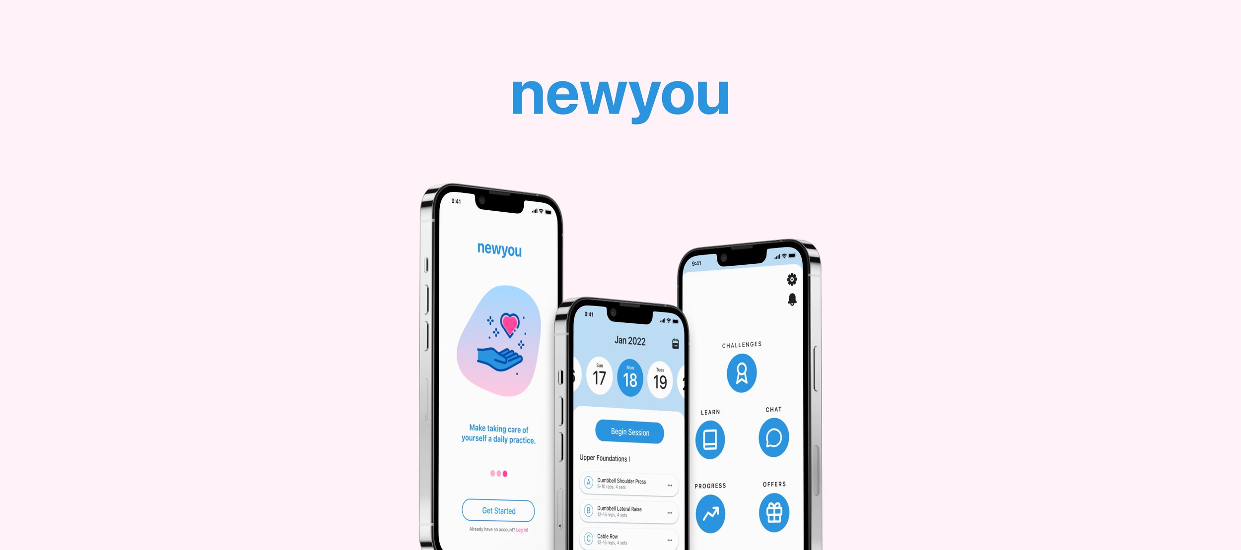
newyou is an application that aims to build a fitness lifestyle that is convenient, challenging, and fun.
Exercising smarter, not harder.
Role
UX Designer
Duration
6 months
Platform
Mobile
The gym is an intimidating place for everyone, especially beginners.
It’s January 1st. Your New Year’s resolution is to finally shed that quarantine weight, and make enough of a habit out of it that you never have to deep sigh in front of the mirror again. Well, here you are. You made it to the gym - and all you hear is the heavy slams of weights hitting the floor, music blasting, and painful grunts from men pushing more weight than you knew was possible.Suddenly, panic. Every machine you planned on using is taken. Your airpods are about to die. It feels like everyone is looking at you. You rush to the only thing you know - the treadmill. You can feel it...deep down, you know you're going to spend the rest of the year paying for a membership you'll never use again.Introducing newyou: a mobile application that serves as a solution to this problem. Newyou sets beginners up for success with workout guides tailored to specific goals, a community forum for questions, and even provides monetary incentives to encourage users to keep going.Here’s how it was developed.
Discovery: What’s the plan?
Before committing to anything, I needed to validate that this was actually a problem that other beginners were going through - not just something that I struggled with. Before starting any secondary research, I structured a plan to keep me centered.Objective
Understand why beginners struggle with the gym, and what factors are stopping people from committing to the gym. Essential Questions
What are the main factors that stop people from going to the gym?What do beginners struggle with the most?Methods
Secondary ResearchUser InterviewsAfter condensing my findings, I rooted out three main factors that provided clarity to my posed questions. “Gymtimidation"
This is a coined term by the internet to describe the feeling of inferiority while working out. Isopure found that 1 in 2 people struggle with this.
Lack of Confidence
Surveys done by Bryant University found that women felt uncomfortable training because of lack of knowledge about gym equipment and body comparison to others.
Convenience and Time
OnePoll found that only 29% of survey participants found going to the gym to be “convenient”.
Now that I had secondary research to back up my initial assumptions, it was time to talk to real people to uncover insight about their specific pain points and needs within their current fitness lifestyles.Discovery: User Interviews & Affinity Mapping
A short screener survey allowed me to connect with 5 participants aged 18-45 who were beginners in the gym. I created a list of guided questions for our discussions, and documented their responses.Once I finished the guided discussions, I color coded key information within the text to categorize it. In order to make my findings more digestible, I organized them into an affinity map to begin synthesis.My main insights after affinity mapping were as follows:
Time and money are an issue when it comes to consistency.
Being social, friendly competition, and progress photos are major motivators & add more fun to the daily routine.
Health and overall “good feeling” are what most gym goers are after.
It’s hard for people to find a program that suits them especially when there are past injuries and disabilities involved.
After discovering themes within my findings, I used insights from both my secondary research and affinity mapping and applied them to a persona to help me re-focus my attention on the potential user and their specific needs. While developing my persona, I kept three key research insights in mind:Exercise routines are deeply personal.
Customizations and substitutions are required in order to be effective for the individual.
Users crave social interaction and validation.
Community and a sense of belonging will give them the support they need.
Users shouldn’t feel inconvenienced by the gym.
It’s important for programs to be tailored to their schedules and remain budget friendly.
Synthesis: Personas
Brainstorming for a Solution
Based on findings from my research synthesis, beginners are struggling because of intimidation, a lack of confidence, and inconvenience. Their main motivations are to feel better about themselves, engage with others socially, and challenge themselves. What kind of solution do I need to create in order to ...…build more confidence in beginners?
…make tailored fitness programs more accessible?
…make working out more enjoyable and exciting?
…make it easier for beginners to prioritize exercise over other tasks?
Before I began creating screens, I needed to brainstorm some key features that the application needed. I took my pen to some paper, and let my brain go free.I thought of what my persona, Hazel, would need while brainstorming solutions to key pain points:
Educating —> Build Confidence while exercising
Workout programming —> Convenience & anxiety relief
Challenges & Rewards —> Incentive & fun
Chatrooms —> Socialization & support to seek help and inspiration
Site Map & User Flows
Now that I had a basic idea of which direction I needed to go with my product, it was time to lay out the foundations of it's architecture. I created a site map and drew out flows of the user's journey through red routes.Workout programming is the priority in my solution, but educational and communicative resources are also of upmost importance so that users like Hazel feel supported. That's why I included forums to build a community within the app, and a resources page for users to reference if they craved further education. I also included an offers page for a rewards feature I ideated to incentivize the user.Above is my user journey for fulfilling a workout. Mapping out the specific aspects of my user's journey gave me a more directed idea of the screens I would need to develop once I began the next step, which is sketching.Sketching Screens and Guerilla Testing
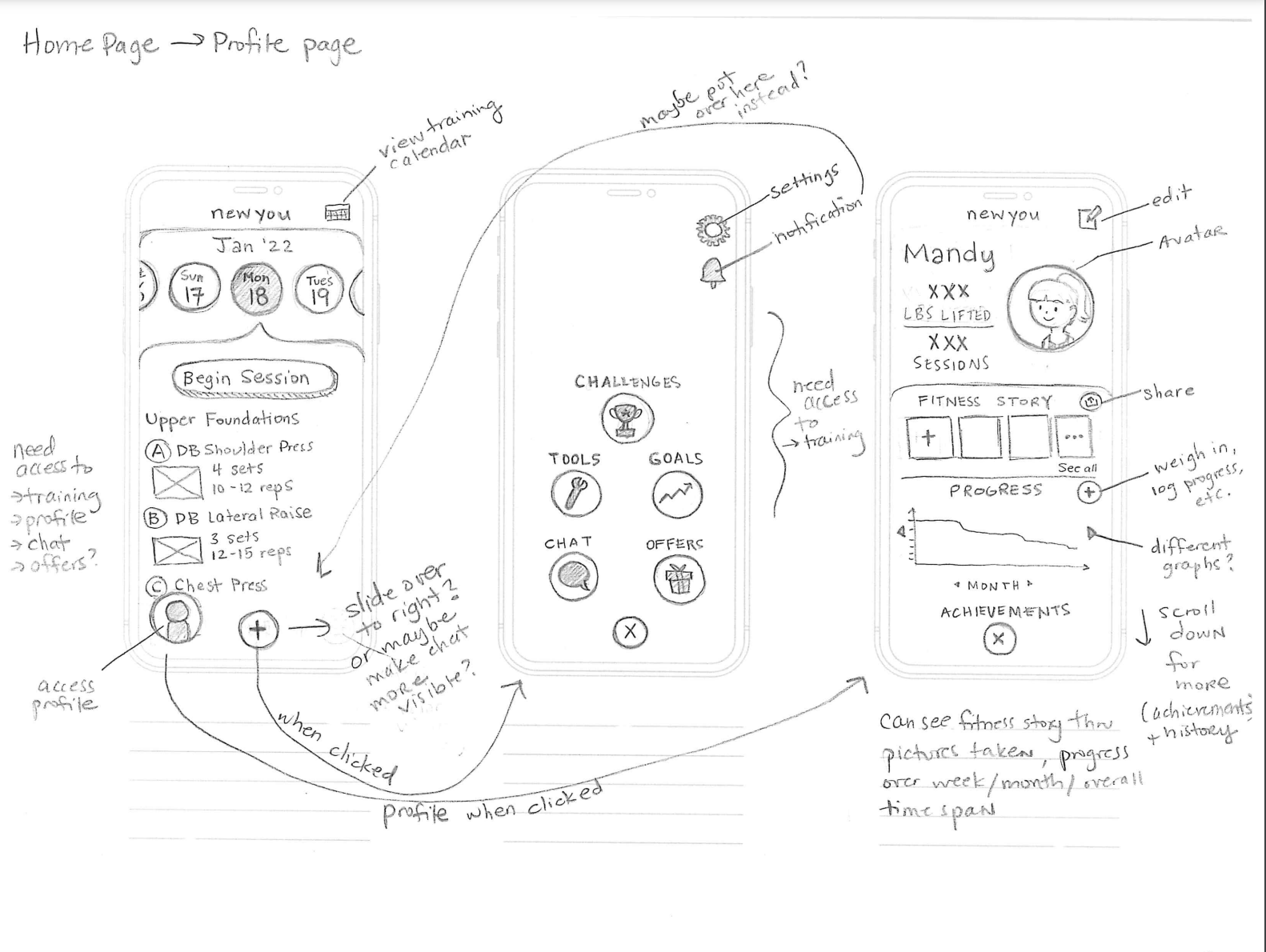
After organizing all the routes in my solution, I began sketching screens! I knew my application had a lot of features that needed to be organized, so I took structural inspiration from popular applications such as Pokemon Go that I felt successfully dealt with a similar issue.I went ahead and created a quick prototype to undergo a round of guerrilla testing. This would help to hash out any early usability issues that presented themselves before developing wireframes.Check out the prototype below!Results from guerrilla testing were as follows:5 out of 5 participants understood the function of the application
2 out of 5 participants didn’t read the profile icon as a clickable element
Participants enjoyed personalized interactive elements
Participants agreed that the interface was “clean” and “straightforward”
These results told me that though my application function was clear and the interface was easy to navigate, some of the clickable elements needed to stand out more in order to be recognized.
Participants disclosed that the onboarding quiz made them feel like they were getting a program that was tailored to their needs, and enjoyed being able to "rate" their workout at the end of the session.
With that being said, I was excited to begin wireframing!
Wireframing
While creating my wireframes, I made sure to implement the feedback I received during the round of guerrilla testing. Though I kept the profile icon the same, I added a drop shadow to the button in order to make it read as a clickable element and increased its size to bring more attention to it. I also wanted to maintain the “clean” interface that my participants liked about my sketched screens, so I tried to include the least amount of information necessary to keep it minimalist. Ideation: Mood Board & Style Guide
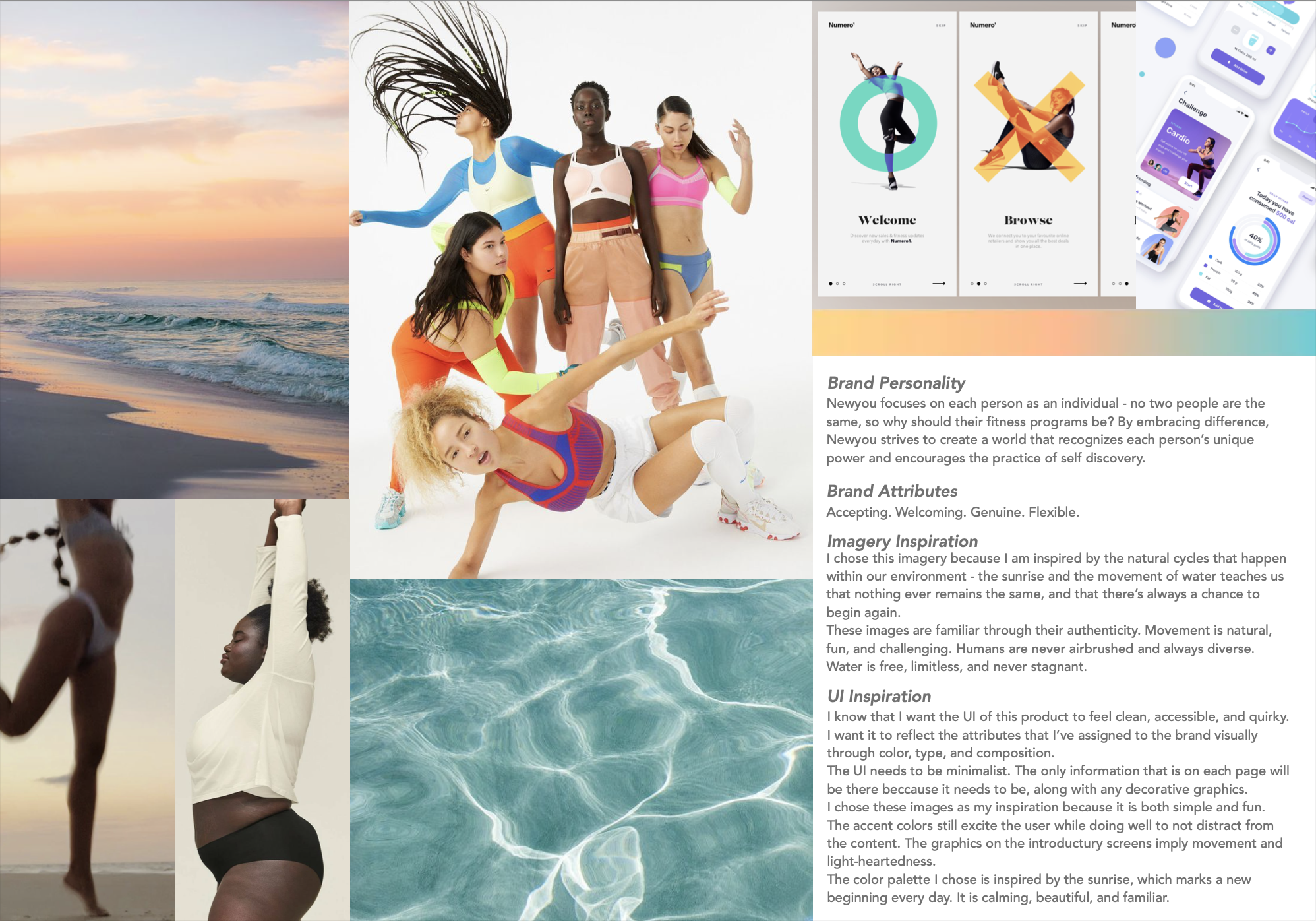
Before I got into my low fidelity designs, I created a style guide so that all of the colors and fonts were cohesive. I started off with a mood board to establish the general aesthetic of my design decisions, which was heavily inspired by movement both in nature and in the human experience. I then used my mood board to inspire the direction for the color palette and font family. I chose hues of blue and pink to brand newyou as fresh and fun, and stuck with something simple and familiar for the font - San Francisco Pro.Lo-Fi Screens & Testing
It was finally time to add life to my wireframes! I added splash screens and a log in screen to make the testing experience more realistic for my participants. In my first round of testing, I uncovered a good amount of readability, usability, and accessibility issues that needed to be addressed:3/5 participants found the UI on the homepage to be “cluttered” and “busy”.
2/5 participants found the text throughout the prototype to be difficult to read.
3/5 participants wanted to view all challenges available to them, but couldn’t because that feature was not available.
Inconsistencies in the alignment of UI elements were found to be distracting for the participants.
Iterations after Testing
My first round of testing showed me that I still had plenty of work to do. It was clear that the UI was distracting, and thus damaging the overall experience. Testing also uncovered a couple of features that were still inaccessible for the user. It was back to the drawing board for me!Before, newyou’s interface lacked contrast, making it visually inaccessible. The text was too small for most users. I went ahead and:Enhanced contrast by changing the background fill from a colored gradient to a bright neutral.
Removed unecessary and unreadable text, and enlarged text size of headings.
Improved the graph and alignment to make screen transitions more seamless.
Enhanced consistency in the shape of clickable UI elements.
Participants also disclosed that the home and navigational screens were "cluttered" and "busy". So, I went and made changes to those as well:Removed images from exercises in the workout preview to condense information.
Isolated profile clickable button to bring more attention to it.
Spread out icons on navigational page to enhance balance.
As for the usability issues such as not having access to "all challenges", I added that connection for the next round of testing. High Fidelity Designs & Testing
After applying iterations to all of my screens to enhance the UI experience, I was ready to re-test with 5 different participants to see if prior issues were resolved.Check out newyou's hi-fi prototype below!After re-testing with new participants, the feedback I received indicated that prior issues were resolved. Woohoo! Here were my main findings:5/5 participants found the UI to be “simple” and “straightforward”
5/5 participants expressed excitement about the features available, which told me that they were no longer distracted by the UI and their focus remained on the content.
No comments about readability, which indicated that accessibility was improved.
Recap: What did I learn?
There are definitely things that I would do differently now that I've gotten through this entire process. Although no project will ever truly be "complete", here are my main takeaways:Less is usually more.
I’m an artist at heart - I love color! While developing my lofi screens, I thought all the color I was adding was giving newyou some personality, but it was really just distracting the user from the content and taking away from their experience. This taught me that in design, I have to detach myself from what I think is visually pleasing and re-focus on what makes a product usable.
Testing is one of the most essential parts of UX work.
Before testing, I have to admit… I thought my lofi designs were solid. I was surprised at the feedback! But it forced me to look at my work more objectively, and from a more relevant perspective. Now, I look back at my initial screens and can see how much my product truly improved.


